Add Colour To Your Desk Setup Like A Pro - 4 Essential Theories
To truly make your desk setup feel like yours and add a touch of charm, colour is incredibly important.
Don't worry, I'm not here to turn you into a professional interior designer or overwhelm you with complex colour theories.
Instead, we'll explore some simple, yet effective colour basics that anyone can grasp and use to create a desk setup they absolutely love.
Essential Colour Theories for Your Desk Setup
Before we dive deeper, let's get a handle on a few core colour concepts that will be your building blocks for a beautifully designed desk:
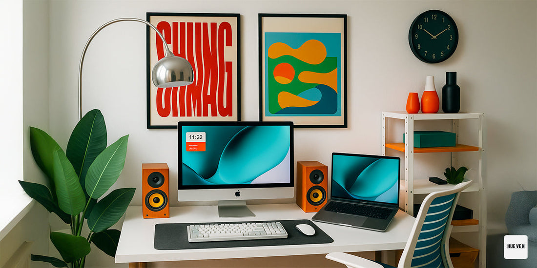
1. Complementary Colours: The Dynamic Duo
Complementary colours are pairs of colours that are directly opposite each other on the colour wheel. Think of them as high-contrast partners that create a vibrant, energetic feel when used together.

*Image Source
Examples: Red and Green, Blue and Orange, Yellow and Purple.
Visual Impact: When placed next to each other, complementary colours create a striking visual impact due to their strong contrast, making each colour appear more vivid. This high contrast can be very eye-catching and dynamic, perfect for drawing attention to specific elements.
Precautions: However, using too much of complementary colours in equal proportions can lead to visual tension and become overwhelming or jarring. It's often best to use one as a dominant colour and the other as an accent, or to vary their saturation and lightness to maintain balance.
When to use? Use complementary colours to highlight specific elements or create focal points. For instance, a desk pad in a shade of blue could be complemented by a small orange accent piece, like a pen holder or a plant pot. Be mindful not to overdo it, as too much contrast can be overwhelming.
2. Analogous Colours: The Harmonious Trio
Analogous colours are groups of three colours that are next to each other on the colour wheel. They usually consist of a dominant colour, a supporting colour, and a third colour that acts as an accent.

*Image Source
Examples: Blue, Blue-Green, and Green; Red, Red-Orange, and Orange.
Visual Impact: Analogous colour schemes are inherently harmonious and pleasing to the eye because they share a common hue, creating a serene and cohesive look. They offer a subtle transition between colours, making them excellent for creating a calm and sophisticated atmosphere without harsh contrasts.
Precautions: The main precaution is to ensure enough variation in lightness and saturation among the chosen colours to prevent the scheme from appearing flat or monotonous. Introducing a small accent from a complementary colour can also add a touch of visual interest without disrupting the overall harmony.
When to use? Ideal for creating a calm and sophisticated atmosphere. You could choose a dominant colour for your desk surface, a supporting colour for your monitor stand, and an accent for smaller accessories like a mouse pad or a small decorative item.
3. Warm and Cool Colours: Setting the Mood
Colours evoke emotions and can influence our perception of a space. Understanding the psychology of warm and cool colours is key to setting the right mood for your desk.
-
Warm Colours (Reds, Oranges, Yellows):
- Psychology: Energetic, stimulating, passionate, inviting, and can create a sense of warmth and cosiness. They tend to advance, making objects appear closer.
-
Cool Colours (Blues, Greens, Purples):
- Psychology: Calming, peaceful, serene, refreshing, and can create a sense of spaciousness. They tend to recede, making objects appear further away.

*Image Source
4. The 60/30/10 Rule: Your Design Blueprint
This classic interior design rule is a fantastic guideline for distributing colours in any space, including your desk setup. It ensures balance and visual interest.
60% Dominant Colour: This is the main colour of your setup. It should cover the largest surfaces like your desk, wall behind it, large desk mat, or monitor wallpaper. This colour sets the overall tone and mood.
30% Secondary Colour: This colour supports the dominant colour and is used for medium-sized elements. Think of your monitor frame, keyboard, mouse, or desk chair. It should complement or contrast the dominant colour effectively.
10% Accent Colour: This is your "pop" of colour. Used sparingly on small items like small decorative objects, specific keycaps, cable ties, or small plant pots. This colour adds personality and visual excitement.

*Image Source
Practical Colour Usage Advice for Your Desk Setup
Now that we've covered the theory, let's put it into practise!
1. Pick a Palette Before You Buy
Before you begin designing your desk setup, it's crucial to select a colour palette. Thousands of inspiring palettes are available online; choose one that resonates with your personal style.

Roughly draft the proportion of each colour, keeping the 60/30/10 rule in mind, then start to select different items based on your chosen scheme.
Committing to this approach will help ensure your final setup is as aesthetically pleasing as you envisioned.
2. Never Miss Out the Large Surface/ Element
The largest surfaces in your desk area—such as your desk itself, the wall directly behind it, or a substantial shelf unit—serve as your primary canvases. These elements fundamentally dictate the overall feel of your setup.
While ideally you could repaint them to align with your chosen palette, they are often fixed infrastructure. Therefore, it's essential to factor their existing colours into your palette selection, especially if they are not neutral tones like black or white.
For instance, if you have a pale brown oak desk and dark walnut wood floating shelves, it's advisable to develop your palette around these existing brown hues rather than attempting to introduce a completely disparate colour scheme.
3. Try Monochromatic Looks
Monochromatic colour schemes involve using various lighter, darker, or more muted versions of a single colour. This approach effortlessly adds visual interest and makes your desk setup look thoughtfully designed, all without needing to dive into complex colour theories.
It's a simple yet effective way to achieve a sophisticated and elegant look.
4. Be Committed to Your Chosen Palette
Once you've decided on your colours, stick to them! Avoid introducing random colours that don't fit your chosen palette. Every new item you bring into your desk space should align with your aesthetic.
This commitment ensures a harmonious and intentional design, making your desk setup a true extension of your personal style.
Designing your desk setup with colour theory isn't about rigid rules; it's about understanding how colours interact and how they make you feel.
By applying these concepts, you can create a workspace that is not only highly functional but also visually appealing and truly conducive to your well-being.
So, go ahead, experiment with colours, and transform your desk into a space that genuinely inspires you!
What's next?
In our next article, we'll explore how to use desk lighting to further enhance the mood and vibe with these colours.
Subscribe so you won't miss out!